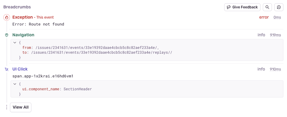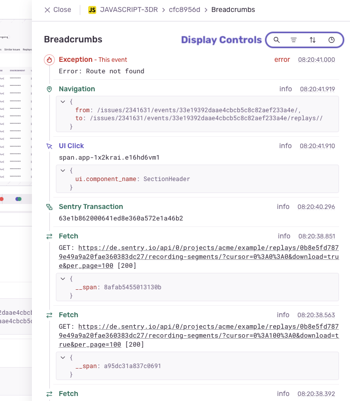
We've revamped the way breadcrumbs are displayed on the issue details page. This has been part usability update, part design update, and you should start seeing the new timeline UI on every new issue in Sentry. You'll no longer get stuck scrolling through breadcrumbs when navigating the issue details page, since this removed the inner scroll, in favour of a 'View All' button to open up a slide out panel.

This new space is dedicated for searching, filtering and sorting your breadcrumbs, allowing you to get full context from the rest of issue while you do so. It can also be opened by selecting any of the query controls from the issue details page. They'll be focused in the slide drawer, letting you get right along with your debugging.

We've also updated the Replay timeline to have the same design language; from look, to colors to iconography.

For more information on breadcrumbs, see our documentation and please share any feedback you have with us on GitHub or Discord.